Gráfico
El Gráfico muestra una vista de su genealogía en forma de gráfico, donde todos los individuos se muestran solo una vez y están relacionados entre sí de acuerdo con sus relaciones genealógicas.
Puede crear sus gráficos de genealogía como desee. La forma del gráfico puede variar de un momento a otro para la misma genealogía, y también con cada adición o eliminación de individuos.

Descripción
Esta vista muestra el gráfico de su genealogía y una barra de herramientas le permite realizar los ajustes que necesita.
El gráfico
El gráfico materializa todas las entidades individuales y familiares de su genealogía como puntos. Otras entidades no están representadas. Estos puntos están conectados por flechas.
Los puntos individuales y unión.
Individuos
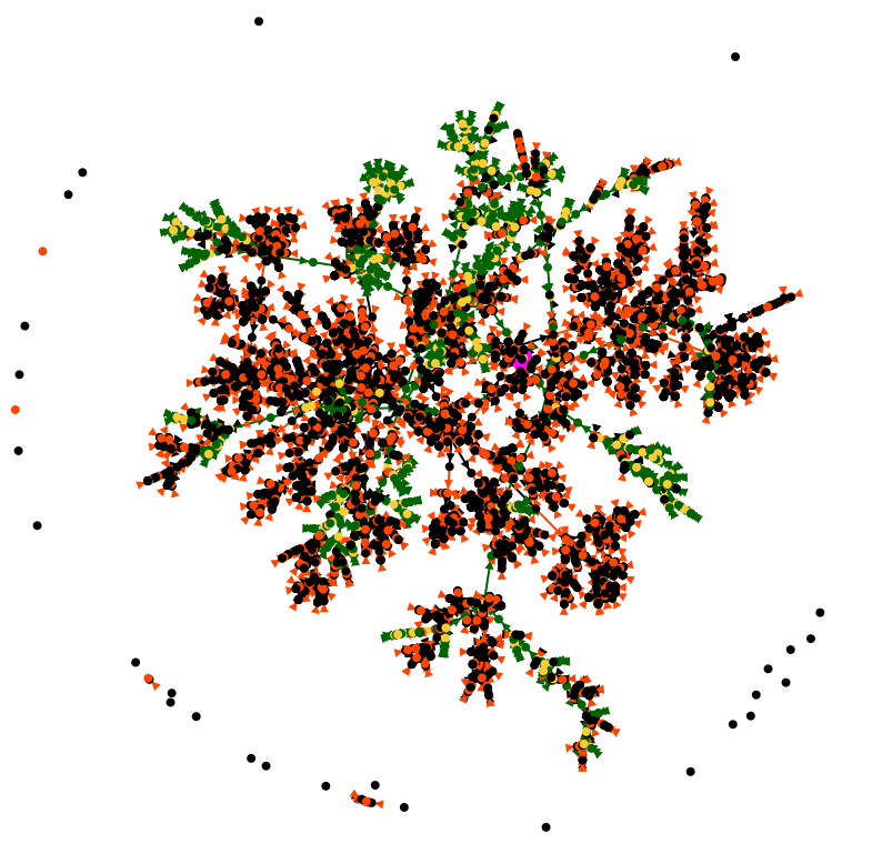
El individuo De Cujus, si existe, es un punto de mayor tamaño y color rosa.
Si se han generado números Sosa en la genealogía, pueden existir uno o más individuos de De Cujus y verá varios puntos rosados. Si no hay ningún punto rosa visible, significa que aún no ha generado ningún número de Sosa o Sosa-d'Aboville.
Todos los demás individuos se materializan por puntos verdes si están en un linaje Sosa de un De Cujus, o por puntos negros de otra manera.
 |
 |
| Sosa individual | Non Sosa individual |
Cada individuo se muestra una sola vez, incluso si es implex, es decir, si es el antepasado común de una pareja casada.
Uniones
Todas las uniones de individuos Sosa se materializan mediante puntos amarillos, las demás uniones son puntos naranjas.
 |
 |
| union Sosa | Union non Sosa |
Cada unión se muestra solo una vez.
El término unión en lugar de familia se usa en el gráfico porque explica mejor el vínculo simple entre dos individuos que el término familia, que generalmente significa un grupo de varias personas. Sin embargo, un punto de unión sí materializa una entidad familiar.
Además, el individuo seleccionado o la unión seleccionada se muestra como un punto azul.
Flechas
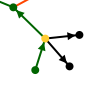
Los individuos y las uniones están conectados por flechas de 3 colores posibles según tres significados diferentes.
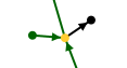
Como los puntos representan individuos y uniones, y debido a que las flechas bajan por la línea de tiempo, las flechas solo pueden representar las dos maneras diferentes que vinculan a un individuo y una unión. O el enlace es el "padre a la unión" o el enlace es "la unión al niño". Y puede haber dos variaciones: ya sea en el linaje Sosa o no.
- Las flechas verdes muestran los caminos Sosa. Comienzan desde los antepasados en la parte superior de su genealogía y descienden hasta De Cujus, alternando entre individuos y uniones
-
- Los enlaces alternan "padre a unión" y "unión a hijo", y son Sosa. Así que la unión es amarilla. Ejemplo:

-
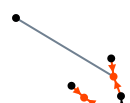
Las flechas naranja y negra muestran los caminos que no son de Sosa:
-
Las flechas naranjas son enlaces de "padre a unión", no Sosa. Así que esta es una pareja y su unión sin hijos:
-

-
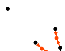
- Las flechas negras son enlaces de "unión con un niño/a que no es Sosa".
 |
 |
| Niño/a no Sosa de una unión Sosa | Niño/a no Sosa de una unión no Sosa |
Además, las flechas que conectan a la persona o familia seleccionada son líneas azules.
Interpretaciones
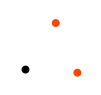
Individuos aislados, uniones aisladas, árboles aislados
Los individuos aislados son puntos negros aislados. Por lo general, estas son personas en su genealogía que han sido testigos de eventos, o personas que ha capturado y aún no ha identificado relaciones.
 Usando la configuración, puede ver la relación en el caso de testigos o personas asociadas. En tal caso, aparece un enlace gris con otro individuo o una unión del gráfico. A continuación, puede ver la relación de este testigo con la persona o los eventos con los que se relaciona.
 |
 |
| Individuo singular en la parte superior izquierda |
De hecho, es testigo de una boda no Sosa. |
Si encuentra uniones aisladas, probablemente sean errores o entidades familiares que se introducenn. Aquí, dos uniones aisladas junto a un individuo aislado:
Finalmente puedes encontrar árboles aislados de todos los tamaños. Aquí, un pequeño árbol que consta de 3 uniones y 4 individuos:

Por cierto, puedes ver aquí que incluso si las 3 uniones son entidades familiares, difícilmente podemos hablar de "familia" en el sentido de un grupo de personas formado por padres e hijos. Además, se puede detectar un error allí porque el individuo en negro a la derecha es el hijo resultante de 2 uniones diferentes en naranja, lo cual no es posible.
Familias numerosas
Las familias numerosas son grupos con muchos puntos negros a su alrededor. Aquí hay dos ejemplos:
 |
 |
| Familia numerosa Sosa |
Familia numerosa no Sosa |
Ancestros en parte alta árboles
Los individuos en la parte superior de su genealogía son los puntos verdes desde los cuales solo comienza una flecha. Por lo tanto, son 1 o 2 puntos verdes (los padres de los antepasados) que van a un punto amarillo (su unión).
Estos son algunos ejemplos:
 |
 |
 |
 |
| Couple of treetop ancestors with a child | Treetop ancestor alone with 3 children |
Treetop ancestor as a single parent of a family of 7 children (6 of which can be seen here) |
Treetop ancestors only |
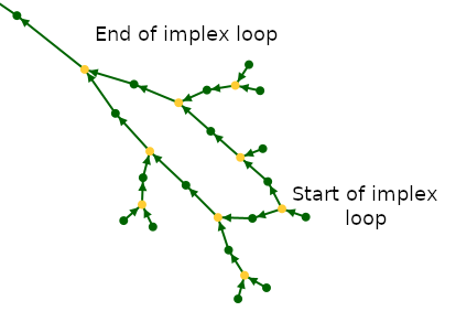
Implexes
Because of the construction of the green arrows, all the green loops you see are actually the result of the implexed ancestors at the top of these loops.
The implexes are in fact ancestors that appear several times in a classic family tree. In the graph, they appear only once.
We therefore propose another definition of the implex: it is the union from which a consanguineous marriage will be born a few generations later. For each implex, we thus find ourselves with a loop in the graph, with the union of the implex ancestors at the top of the loop, and the consanguineous union at the base.
Here is an example from the Kennedy genealogy (the top of the loop reads in the direction of the arrows, it is at the bottom here) :
Case Study
Here is an example summarizing several of the interpretations above.
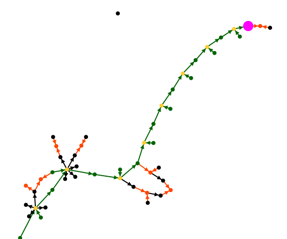
In the following example from the Bourbon genealogy, we see our De Cujus in pink who happens to be Louis XVI. To his right is his marriage with Marie-Antoinette whose ancestors are not shown.
If we go up the green arrows, the long branch is his ancestor line, where in each generation there is only one spouse. The other children are not shown if there were any.
We notice that this branch reaches a green individual, who is Louis XIV, from whom a first loop of implexe starts. It is Louis XIII who had as children Louis XIV and Philip I whose two descendants married each other.
We find a second loop of implexe upper in the ancestor line. It is surrounded by two large families: at the base of the implexe, that of Henri IV. At the top, that of Henri II.
We also locate an isolated individual who is not a witness, and probably shows that we have not finished grasping his relationship with the Bourbon.
The graph is an Ancestris invention and like you, we had never seen our genealogy in this form before. We are still discovering possible interpretations to this form of visualization. Let us know what you discover !
All colors are customizable. See the paragraph on customization below.
Toolbar
The graph toolbar allows you to customize the appearance of the graph. Hover over each icon to display the tooltip explaining its function.

The toolbar presents the following controls:
Zoom slider
This slider is used to adjust the zoom level of the graph display.
Pause automatic arrangement Button
At each opening of the graph view, the graph is built progressively until all the points are spread and visible. This button is used to stop/restart the construction of the graph.
Show / Hide names Button
Click here to show or hide the name of individuals and unions at each point.
For names display, several choices are possible. Refer to the Configure View parameters.
Center graph on click Button
It switches the mouse to "centering mode" when it is pressed. It works in three steps:
- First you click on the button to activate the "centering mode".
- Then you click on the point of the graph that you want to put in the center of the display area.
- You press the button again to quit the "centering mode".
Hide branches Button
It switches the mouse to "Hide mode" when it is pressed. It works in three steps:
- First you click on the button to activate the "Hide mode".
- Then you click on an Individual point or a Union point. A menu appears to select if you want to hide the ancestors or the descendants branch.

- You press the button again to quit the "Hide mode"

After your choice, the graph adjusts accordingly.
The impact on the display is quite logical: a branch disappears.
Sometimes the result can be quite curious: your tree can be separated into several pieces and individuals can be isolated.
You can re-display the hidden branches by clicking on the "Reset" button.
Show / Hide association links Button
This button shows or hide with a grey line, the relationships between isolated individuals and the rest of the graph.
Shortest path Button
It switches the mouse to "Shortest Path mode" when it is pressed. It works in four steps.
- First you activate the "Shortest Path mode"
- Then you click on the first point
- Then you click on the second point
- You press the button again to quit the "Shortest Path mode"
After your choice, the shortest path between the two points appears in blue and a window lists all the individuals between the two selected points.
Clicking on an individual displays it in the other views of Ancestris.
Save Button
The file will be saved with the name of the current tree and can only be opened with this Graph function.
Open Button
This button loads a previously saved graph. This will save you time when you reopen the graph by preventing it from rebuilding itself or to make sure you get back to a look you liked.
Print Button
This button prints your graph. Ancestris will open it automatically with your svg file viewer (SVG is a vector image format.). You will be able to print it from there.
Export Button
Gephi is a free software for network analysis and visualization.
Reset button
This button resets the zoom, name display and hidden branches.
Configure view Button
This button allows you to change the display preferences of the graph. See the Customization section below for more details.
Usage
The purpose of this view is twofold:
- To present your complete genealogy visually in an esthetic form that you like
- Understand your genealogy and identify the parts that are sufficiently complete or conversely the parts that deserve further research.
Present your genealogy
As soon as the Graph is launched, the graph organized itself progressively.
Generation of the graph
With many individuals, this can take a little time.
If you have already built and saved a graph previously, simply click on the Pause button to stop the construction, then click on the Open button to fetch a previously generated graph.
While building the graph, Ancestris tries to find a way to arrange all branches so that each one is clearly visible.
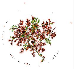
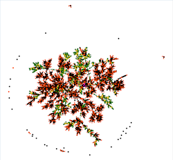
For example, here is the construction of a graph with 4200 individuals and 1300 families:
 |
 |
 |
 |
 |
| Start | 1 minute | 2 minutes | 3 minutes | 3.5 minutes |
| To the first seconds, the graph looks like a "big ball of dots". |
Your graph looks better. Branches are forming. |
The branches are now better detached. | The changes are much less frequent. The graph is almost finished. |
The graph "stops moving". It is finished. |
Modification
During construction, you can manipulate the graph or customize it if you wish.
Once the construction is complete, it is still possible to move points to better arrange the graph.
When you do this, it stretches the point corresponding to where you are moving it, and by inertia to maintain a sufficient distance between each point, it has the effect of a rubber band.
In the pause position, the points move one by one without the elastic effect.
If your graph suits you, remember to save it. It is difficult to find the exact same position from one time to the next.
Selection
Clicking on a point on the graph selects the individual or family in other windows.
Conversely, a click on an individual or family in another window will refocus the graph on this entity, provided it is not in a hidden branch.
Analysis of your graph
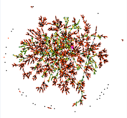
This is the most interesting moment! You had never seen your tree like this, neither had we.
To analyze and understand your graph, you can proceed in different ways.
First there is a global macroscopic view, where you can see whether your tree is made up of a single family group or several. Each family group is in fact disjoint from the others.
In the example above, there is a single family group, with isolated individuals who are probably associations (witnesses, etc.). Here is a larger view to see better:
From the De Cujus in pink, we see a few ascending lines in green/yellow, and many descendants or "cousins" in black/orange.
The longer the green lines, the more generations of ancestors.
We can also guess that there are a few implex loops, but we will have to get closer to be sure.
You can draw many more conclusions from this macro analysis, but let's move now to a closer view. You have to realize that we have here about 5500 points in front of our eyes, the 4200 individuals and 1300 unions, and if you manage to see more, let us know!
By using the cursor button and the mouse to move the graph, we can get closer to De Cujus. When we are close enough, we can then display the names to know who we are talking about, using the toolbar button.
You can then hide the branches that might interfere with the view with the Hide Branches button or show them again with the Reset button.
Your analysis can then be done from branch to branch, successively from De Cujus to the most branches and to cousins or to ancestors.
To have the details of each point, just click on it and the other views will tell you which individual or family it is.
Shortest path
In the window that lists the individuals on the path, you can click on each of the names to make them appear in the other views of Ancestris and thus analyze this path in detail.
Update
The update is done in real time. Any change in your genealogy that leads to the creation or deletion of a family or individual, or the creation of a relationship between them, will update the graph instantly.
Customization
The customization of the graph is done with the Configure View Settings Button.
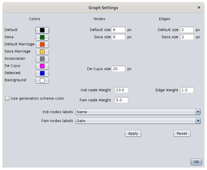
Colors
The left-hand column represents the current colors of the graph elements. By simply clicking on these buttons, you can change the color of the corresponding points and arrows, and the background color of the display.
Clicking on a color will open the color selection window. See the instructions for choosing a color in the Timeline view which has the same color.
A change of color in the settings window immediately happens in the graph but does not generate any modification of the graph structure.
Modification of the graph structure
It is possible to modify the apparent structure of the graph. These changes lead to the reconstruction of the graph, they do not immediately affect the graph. It is necessary to click on the Modify button.
The middle column sets the size of the points.
The right column sets the size of the arrows.
The weights adjust the size of the points relative to the arrows.
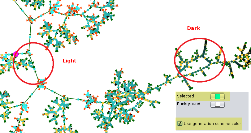
The checkbox Color gradient by generation helps distinguish the generations by color.
This function colors each generation with the same color gradient from the selection color to black. For the gradient to be clearly visible, it is necessary to approach light pastel colors, as in this example :
Modify Button
It modifies the display of the names according to the choices in the drop-down menus if the labels were already visible.
Default values Button
This button updates the structure of the graph to its default values.
OK Button
This Button closes the settings window. leaving the graph as it appears.
Tutorial
There is a tutorial on graphs. It is in French and in PDF format. You can download it here.